As part of a renewed focus on sales skills, I wanted to create a demo platform presentation that the sales reps could refer back to and learn from. I modeled this interactive menu on blu ray menus that allow watches to jump to different chapters. This allows sales reps to quickly review sections in preparation of their own product demonstrations.
Much like the customer types section, I wanted to create an enhanced interactive experience for the learner to help drive retention and assimilation of the information. By including these assets in the trainings, completion percentages increased drastically and buy-in from management increased due to increased performance.
This interactive asset was designed to create a breakdown of the different features offered to customers via the platform. It was important to allow the Sales team to easily access an interactive form with a clear delineation of feature sets. I created this asset using Storyline for the assembly and Adobe Illustrator to create the custom elements.
Part of new hire training involved teaching the Sales Rep how their commission was calculated. Instead of relying on a simple spreadsheet, I created this interactive asset to draw attention to the key areas they would need to look and provided context for what each section meant for their compensation.
I’m a big proponent of using interactive visual assets to engage the learner. Where most designers may have used something as simple as a carousel, accordion, or tabs, I wanted to create a more dynamic way for the learner to interact with the content. Using states, transitions, and leveraging my design skills, I put together this asset to better engage the learner and keep them interest in the content.
This interactive asset was built in Storyline and used elements I created in Adobe Photoshop, such as the icons and the branded background with the paper airplane. This was used as a block in a Rise as part of a larger sales training course.
Branded instructional one-pagers and reference guides
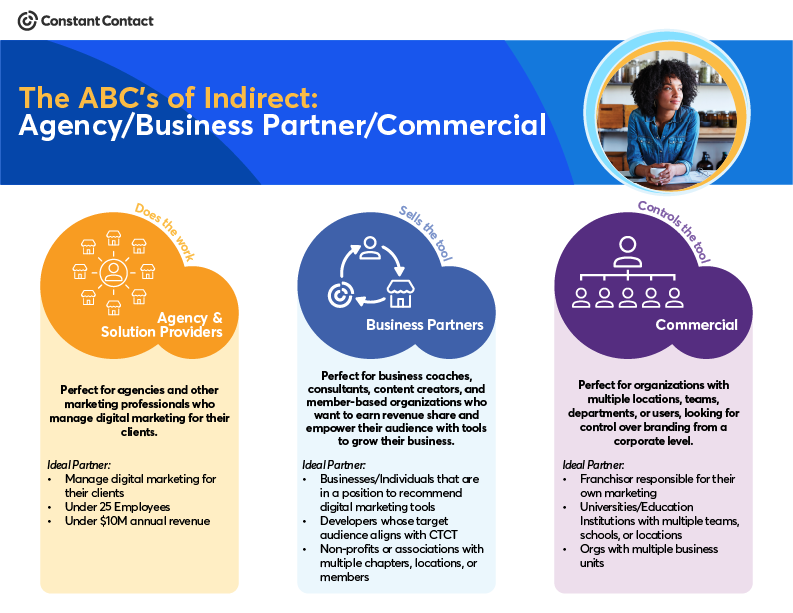
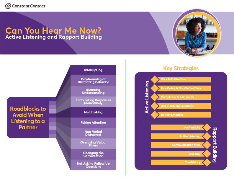
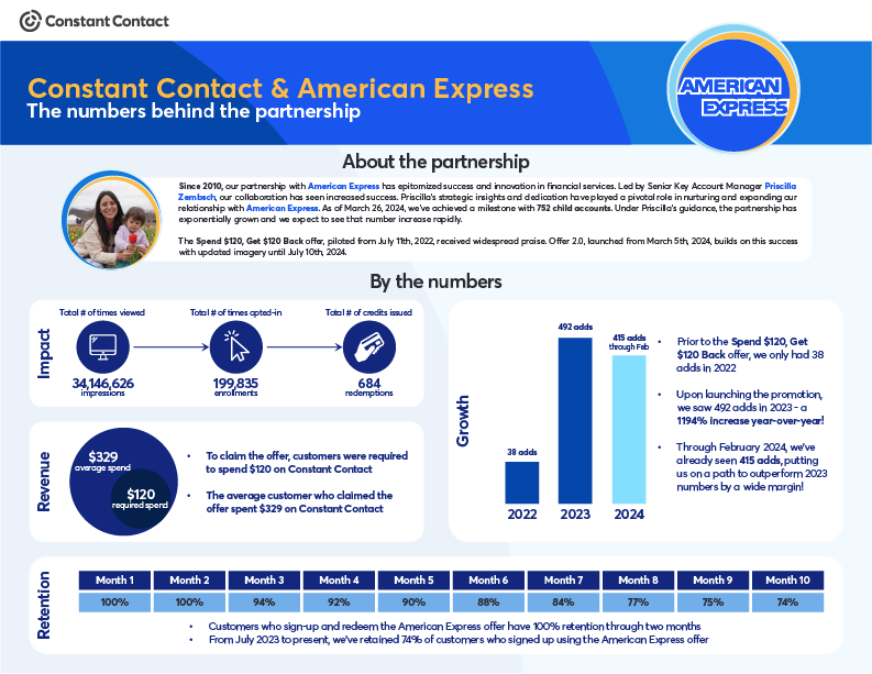
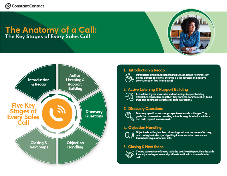
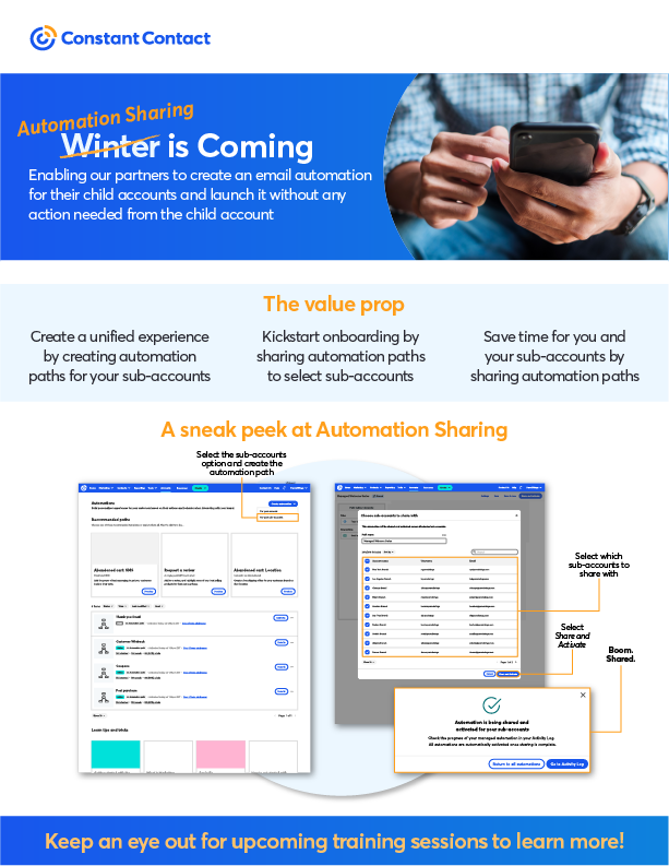
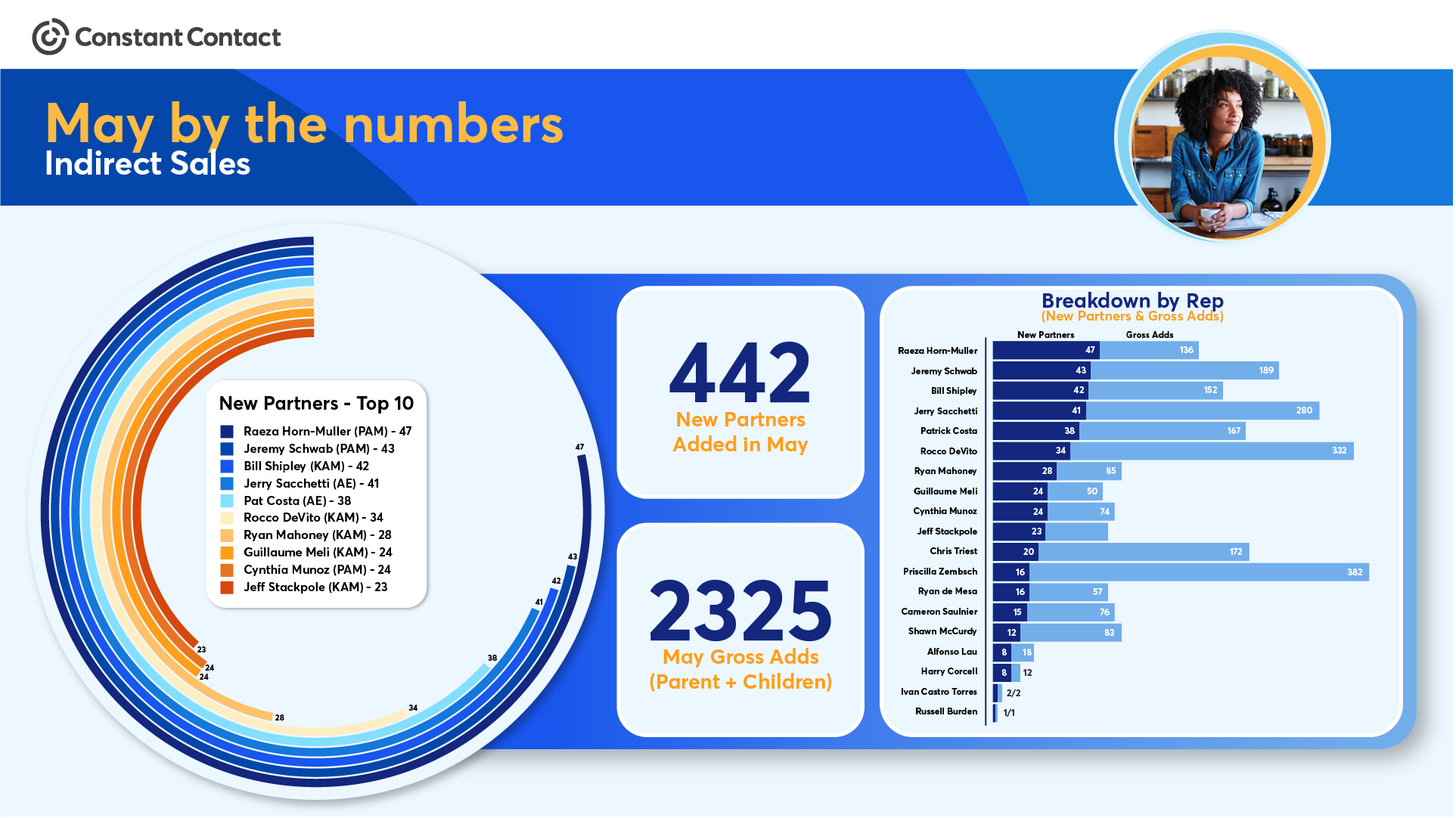
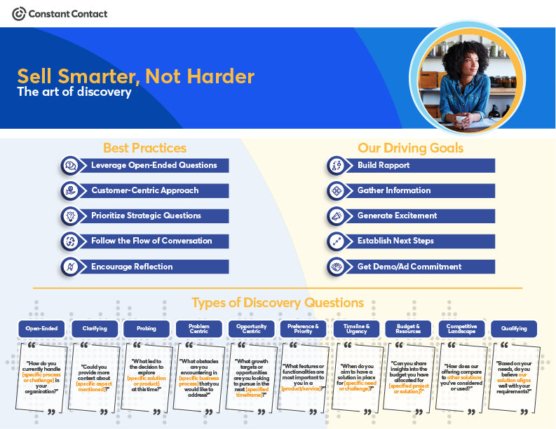
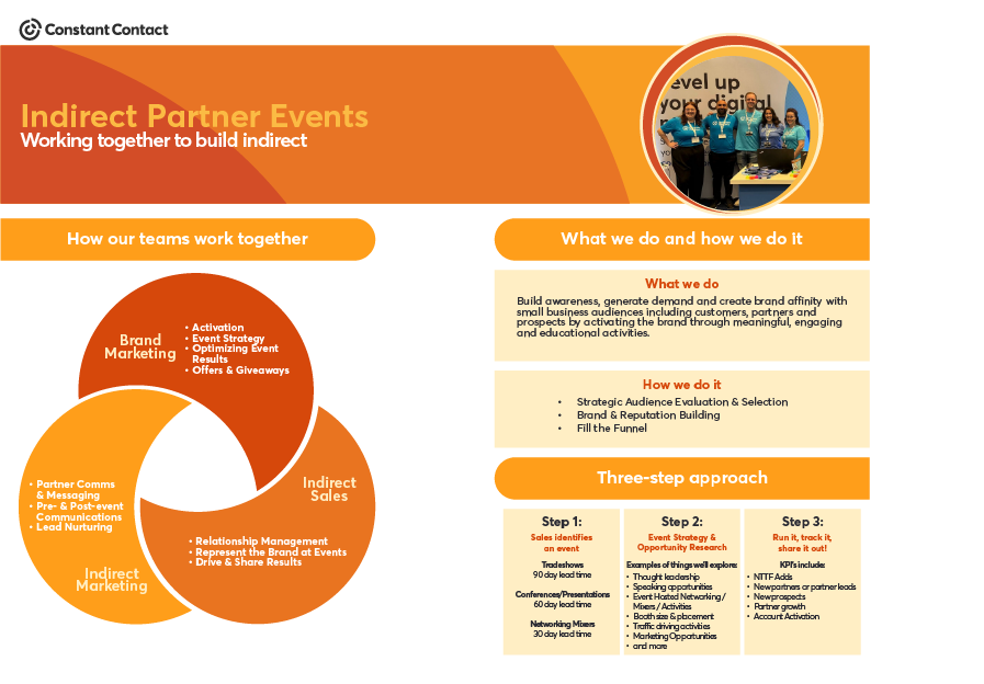
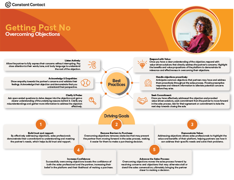
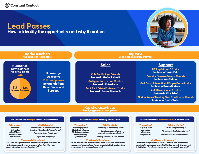
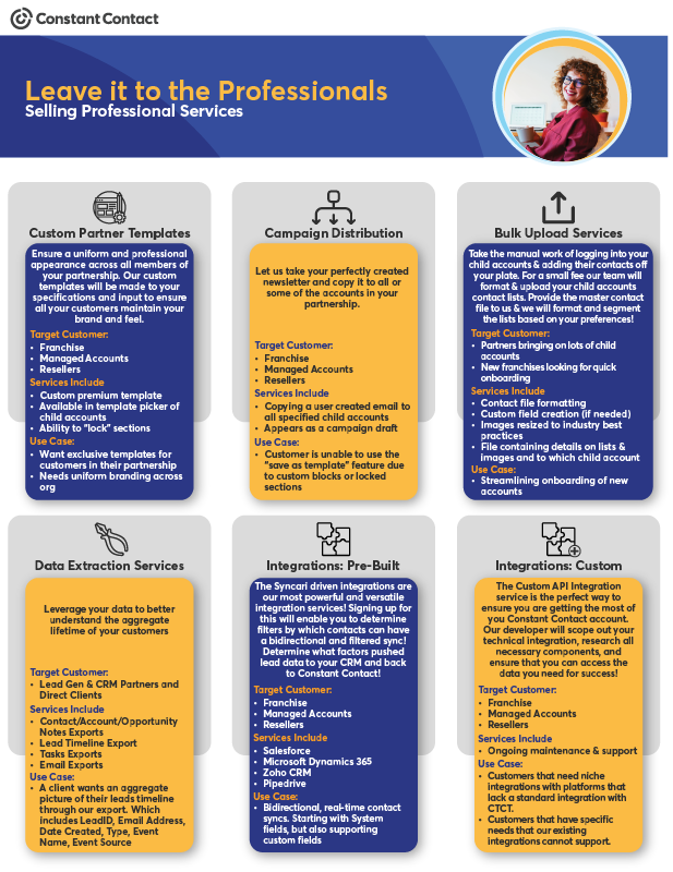
As part of a new sales training program, I created a series of branded one-pagers for a series of webinars and training sessions. These one-pagers took the session content and condensed it down, creating a leave-behind asset that the sales team could refer back to when needed. I tend to always create reference material for ILT or vILT content when adoption may take longer. These materials are for quick reference to assist in the internalization of the content.
One of the keys to my design style is keeping the training visually interesting while still maintaining cohesion in the design. By using similar button styles throughout the training, and leveraging brand design assets, I ensure that each training experience is unique yet still similar in format to allow for a seamless UX.
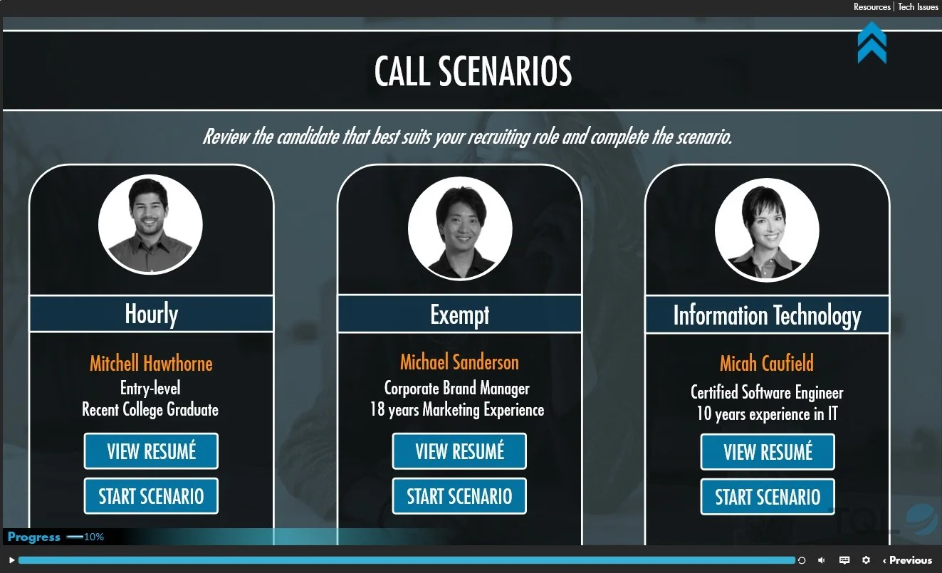
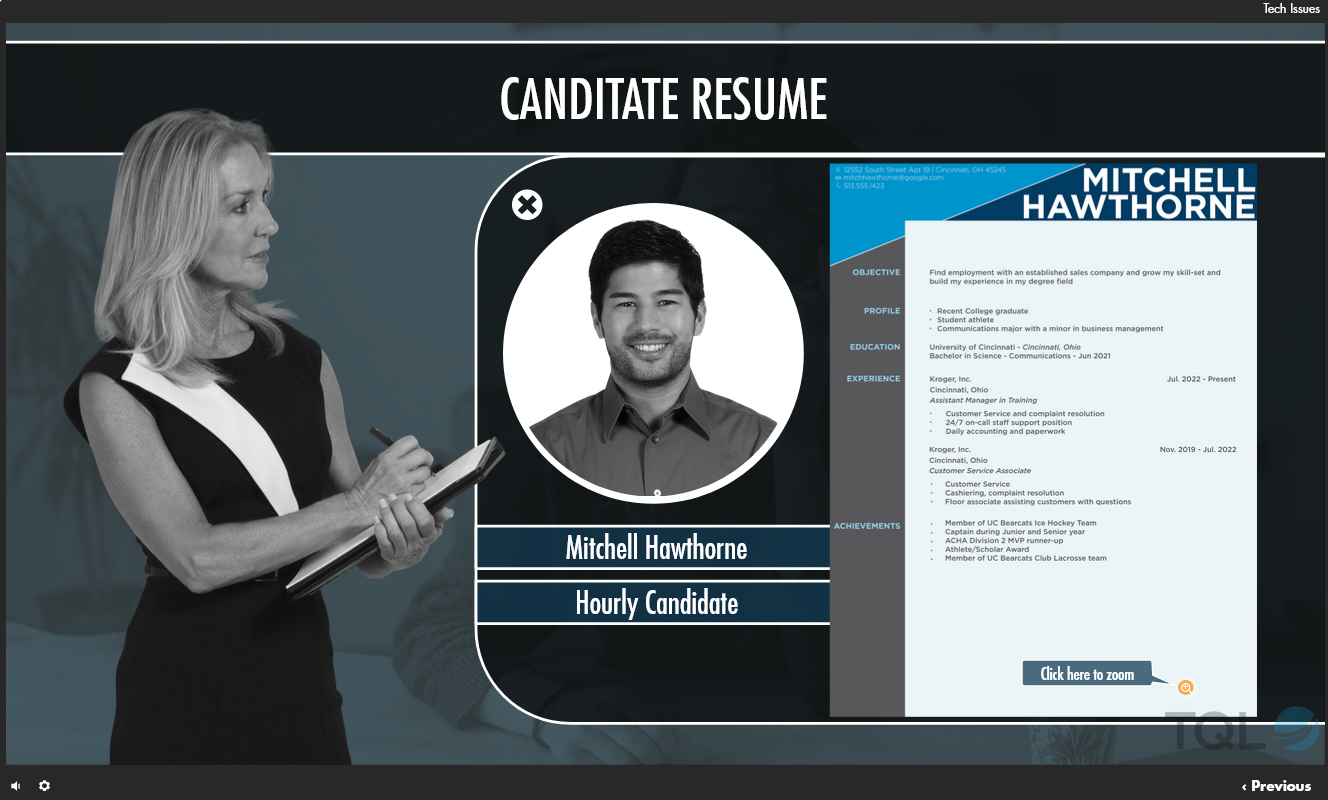
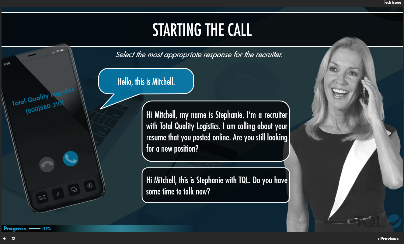
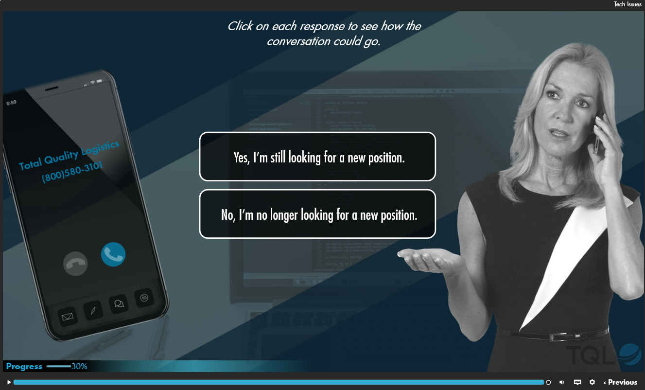
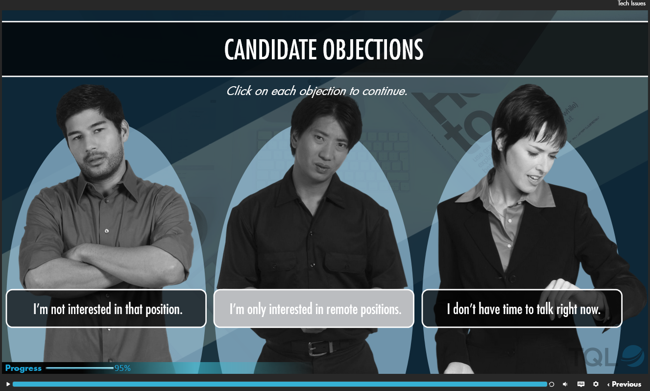
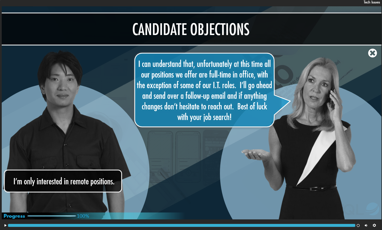
This was an interactive eLearning created in Storyline 360 for corporate recruiters on making sourcing calls to potential candidates. It walks the recruiter through the sourcing call to teach them the correct way to approach candidates. The project required a total of six different scenario paths, with the requirement to complete both an “interested” and “uninterested” scenario for one of the candidate types based on the corporate recruiter’s specific role. To do this, I had to create a series of variables for completion which created a one-time loop back to the candidate response screen, regardless of which path they chose. The end result was a seamless learning experience.
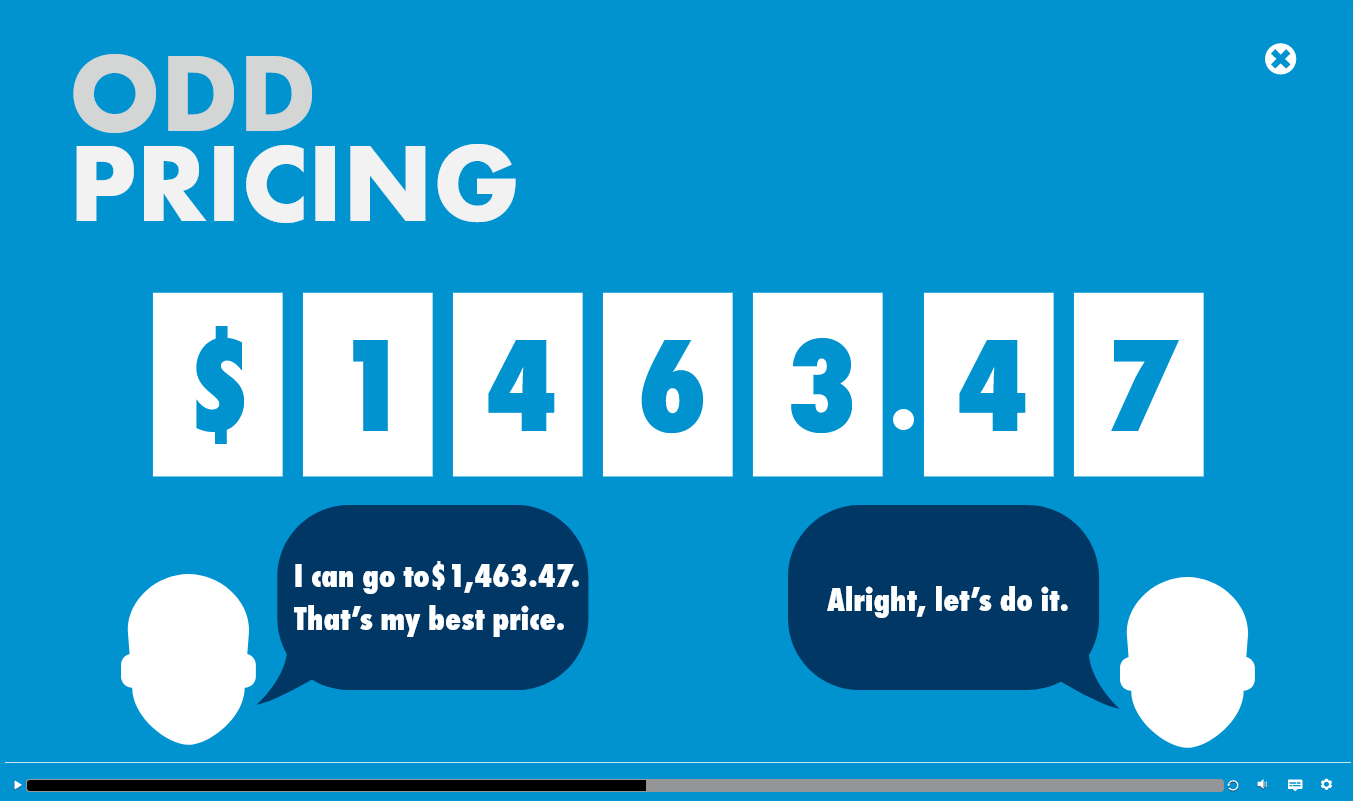
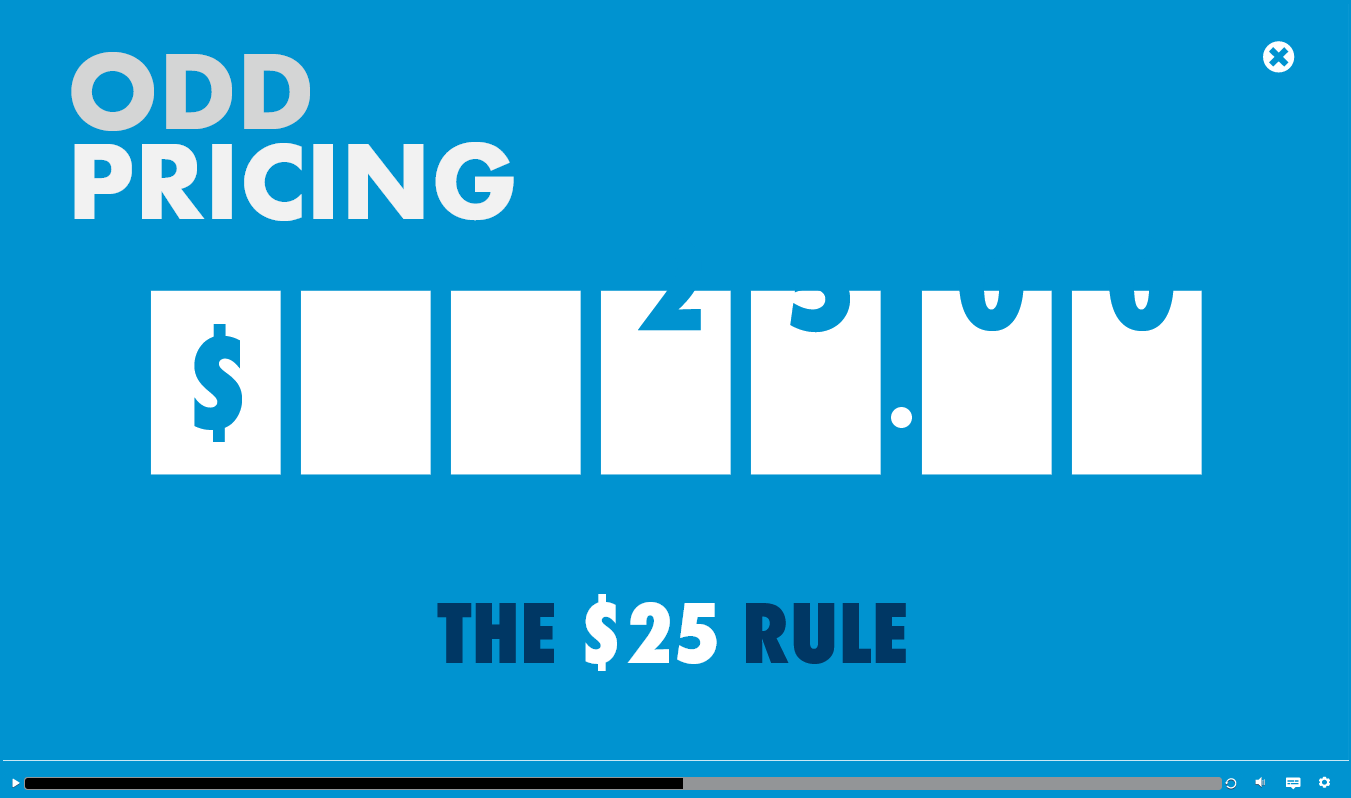
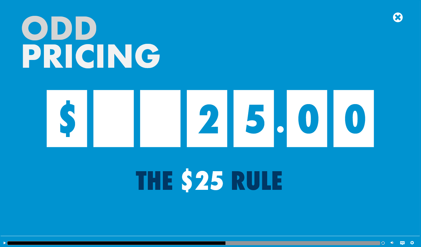

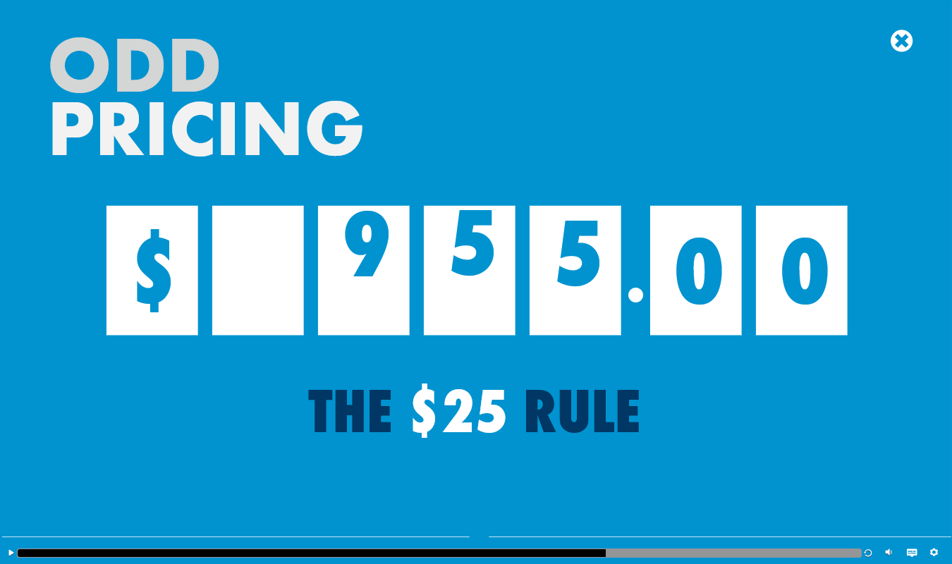
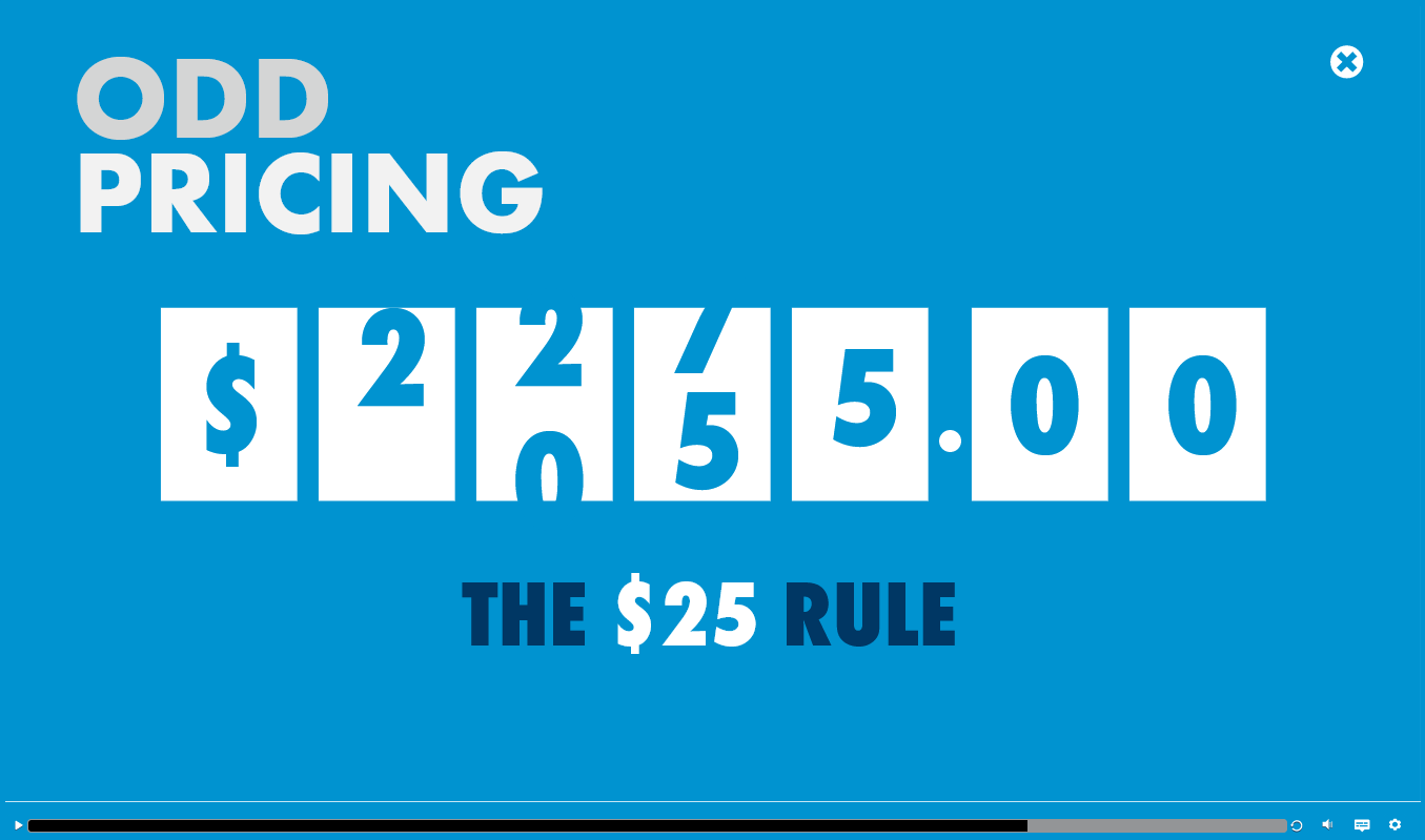
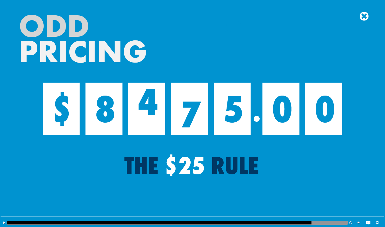
This particular eLearning was designed in Storyline 360 for a sales techniques training. The idea behind the video was to create an old-school odometer style ticker for dollar amounts. Using close to 100 elements with animations and specific timing, the end result turned out just as I’d hoped.
This is eLearning was designed in Articulate Storyline 360. The training guides new recruiters through the background check process. I created dynamic elements using motion paths and long transitions that added more visual interest to better engage the learner. Scene transitions played a big part in making the eLearning feel more cohesive across topics.
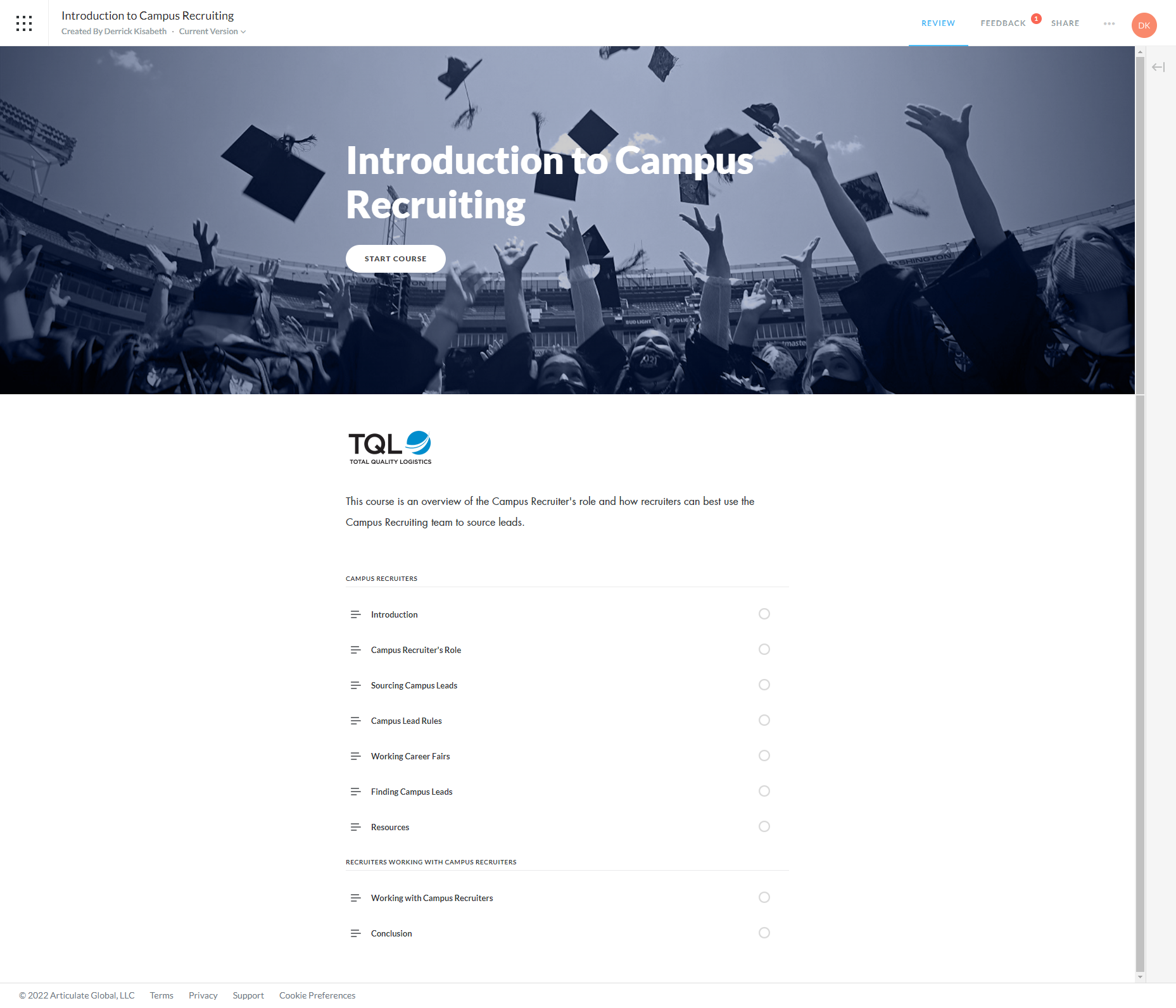
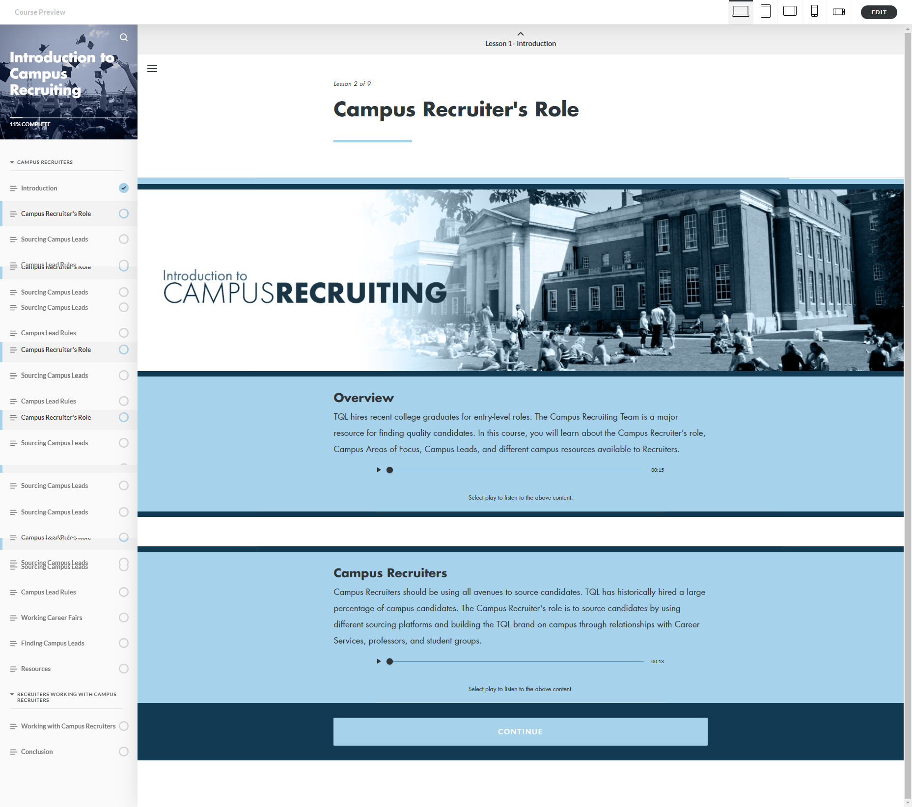
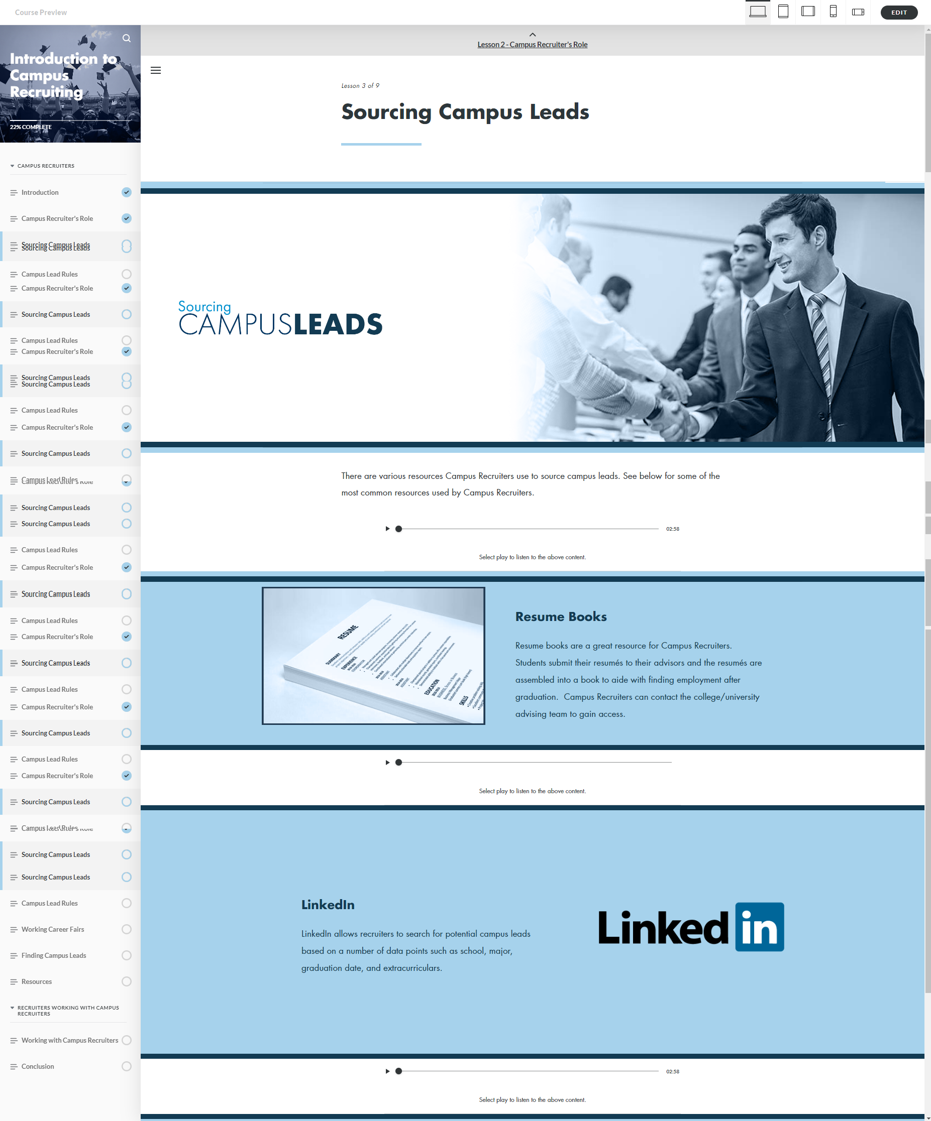
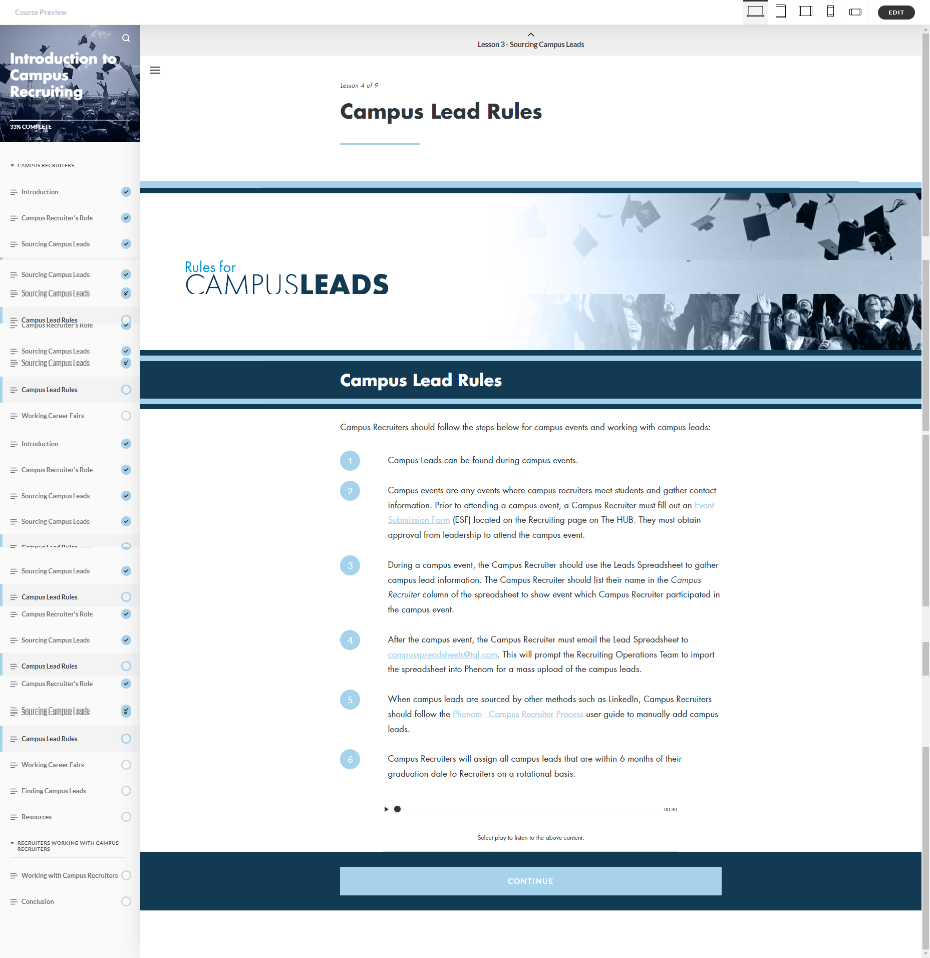
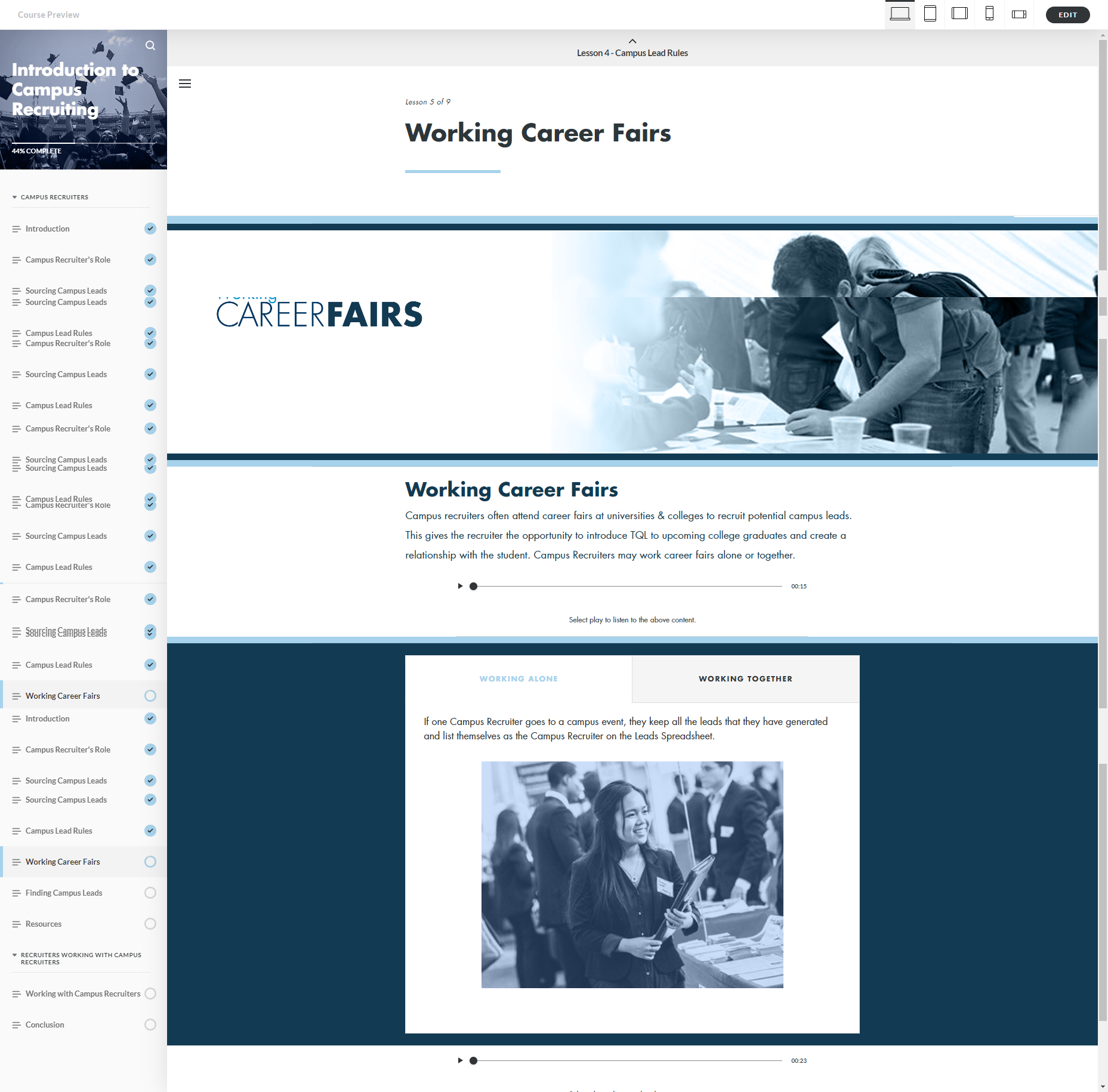
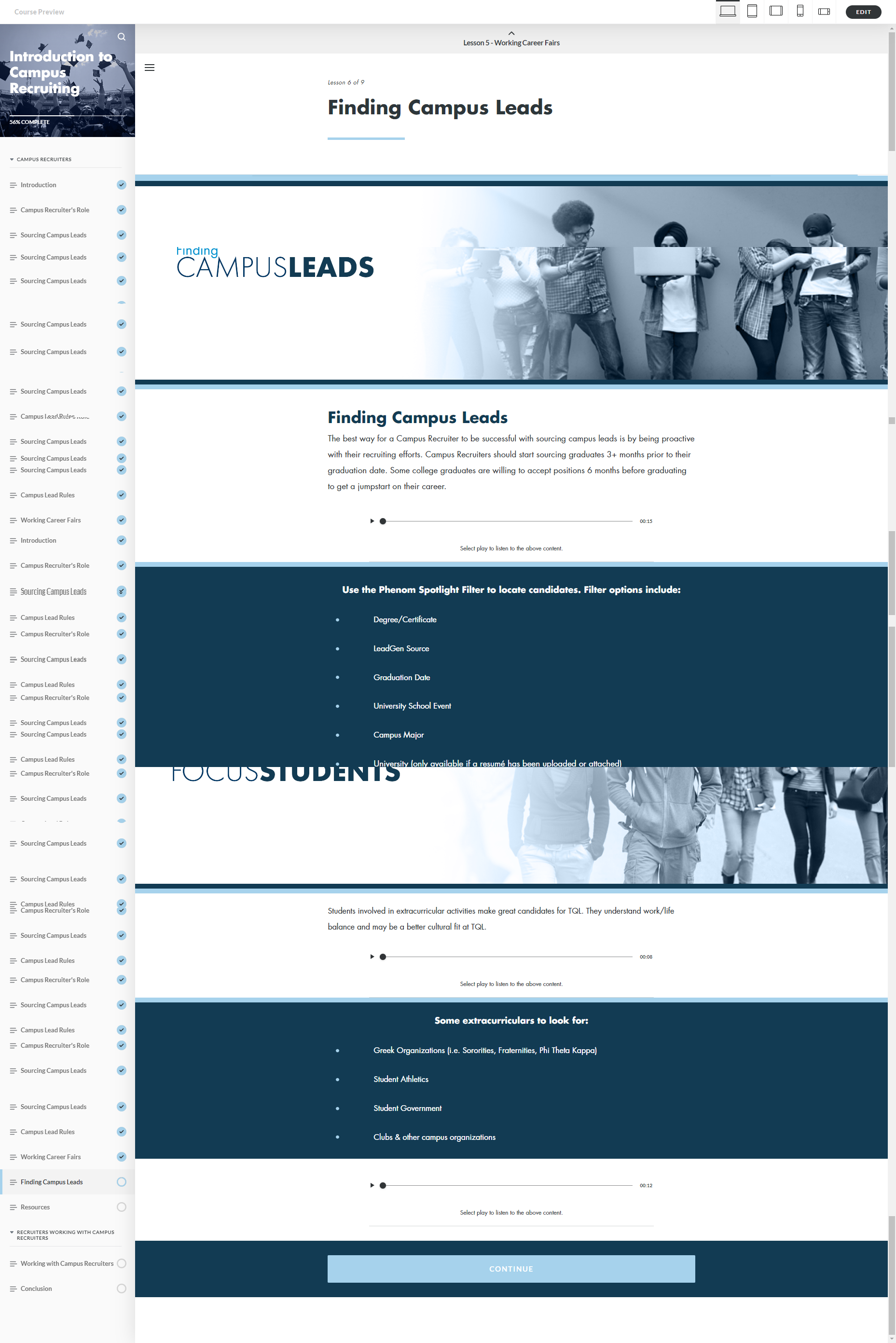
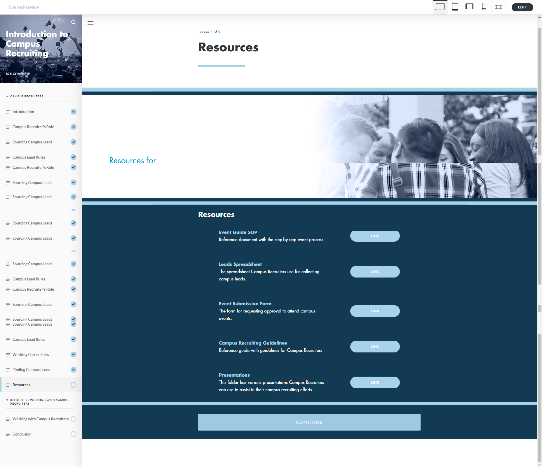
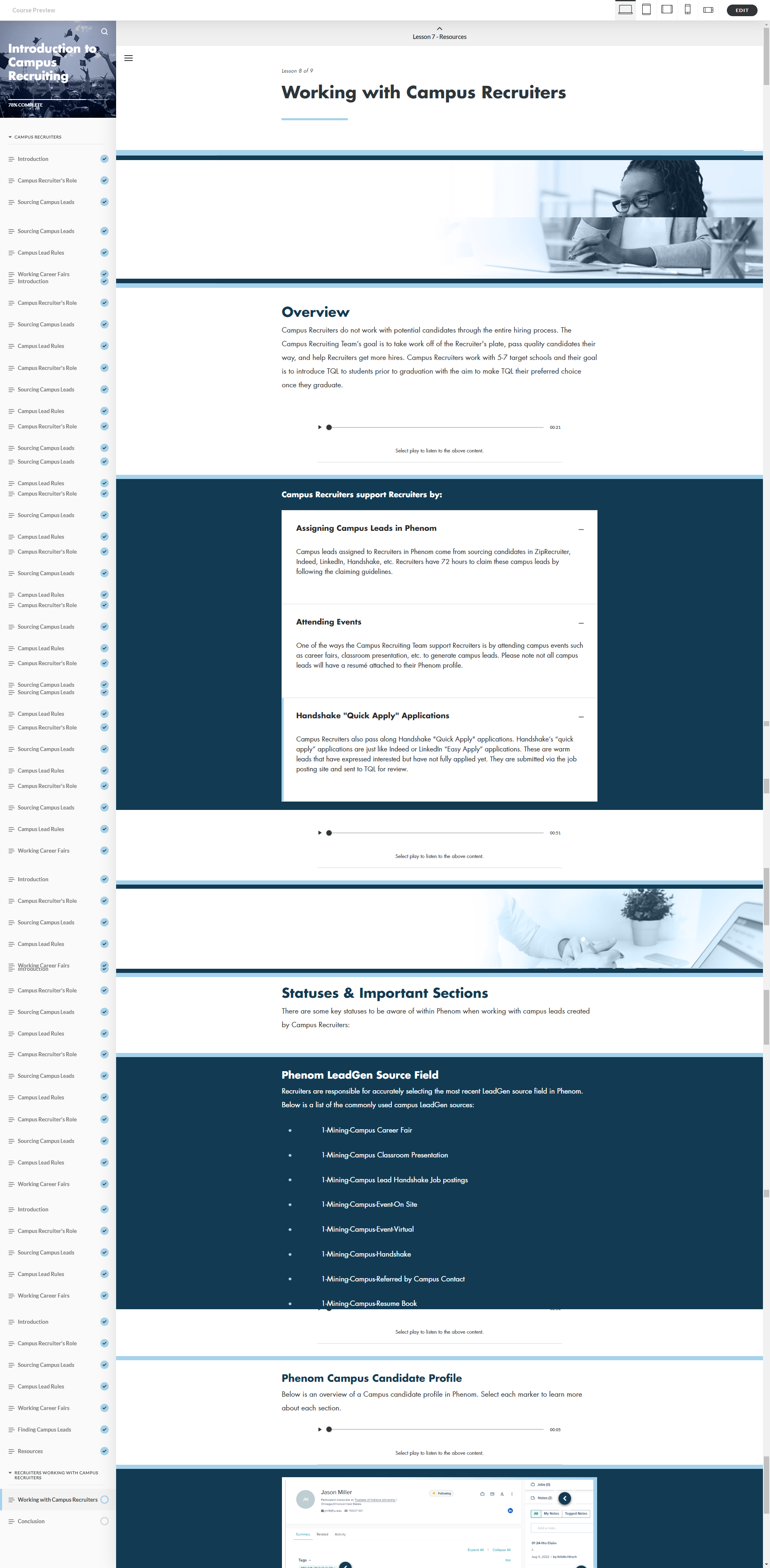
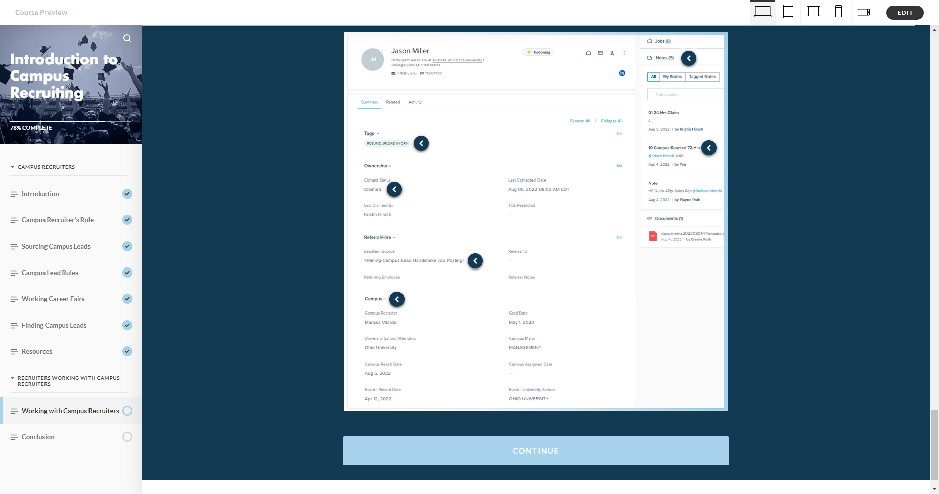
In this course, Sales and Corporate Recruiters are guided through the Campus Recruiting process and how to best work with Campus Recruiters. The design scheme was a departure from the typical Rise for TQL, using two ancillary blues and a tinted black and white color scheme for a more contrasting visual. I created the gradients images in Photoshop to create a visual flow from the title to the image and then to the content.

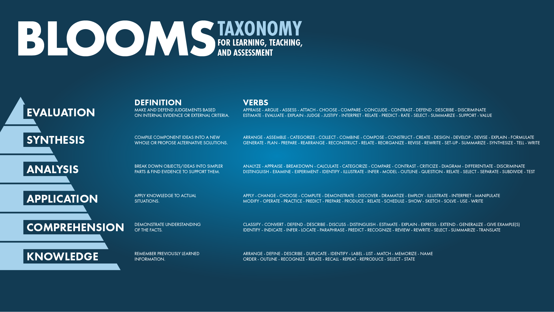
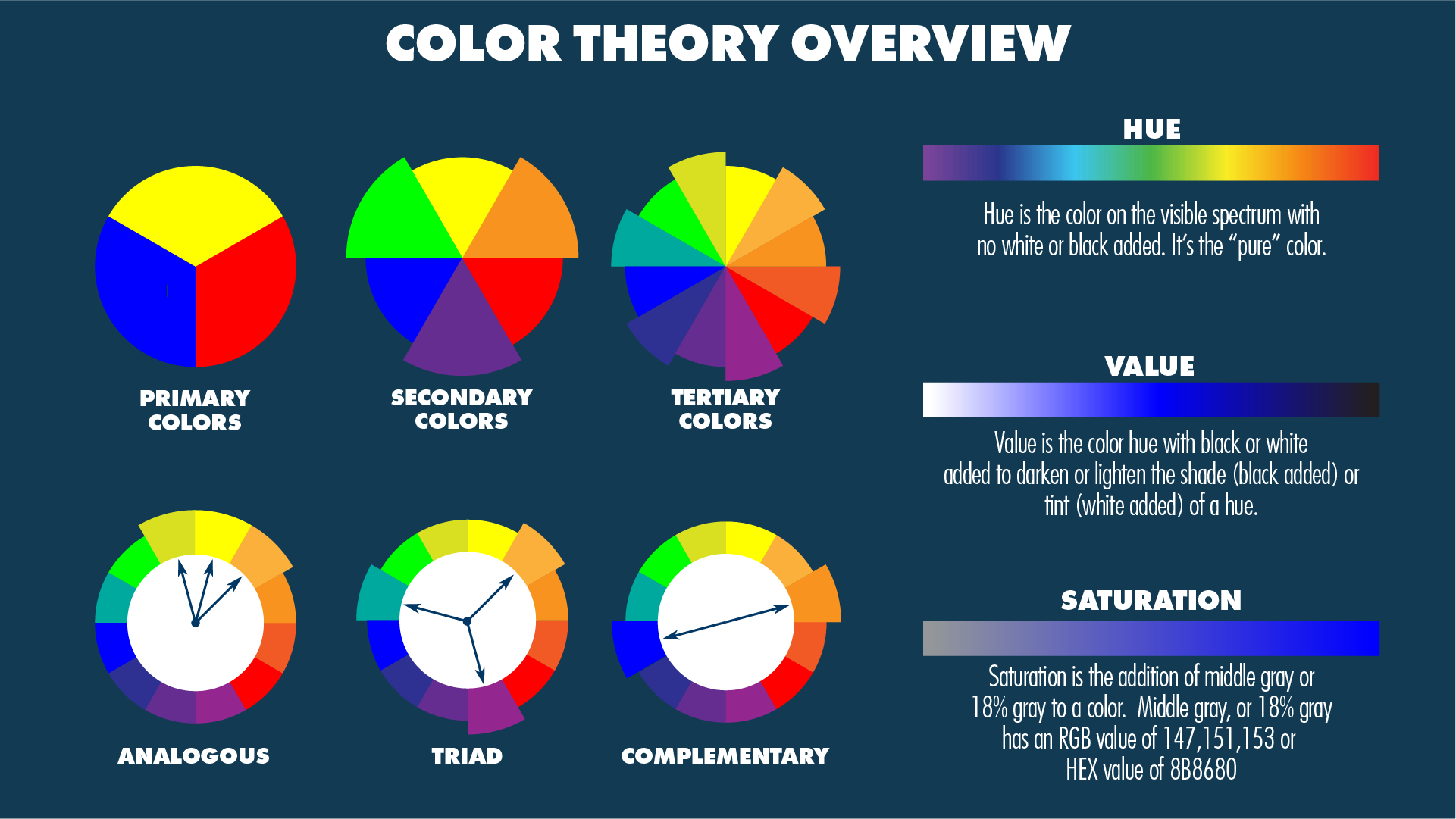
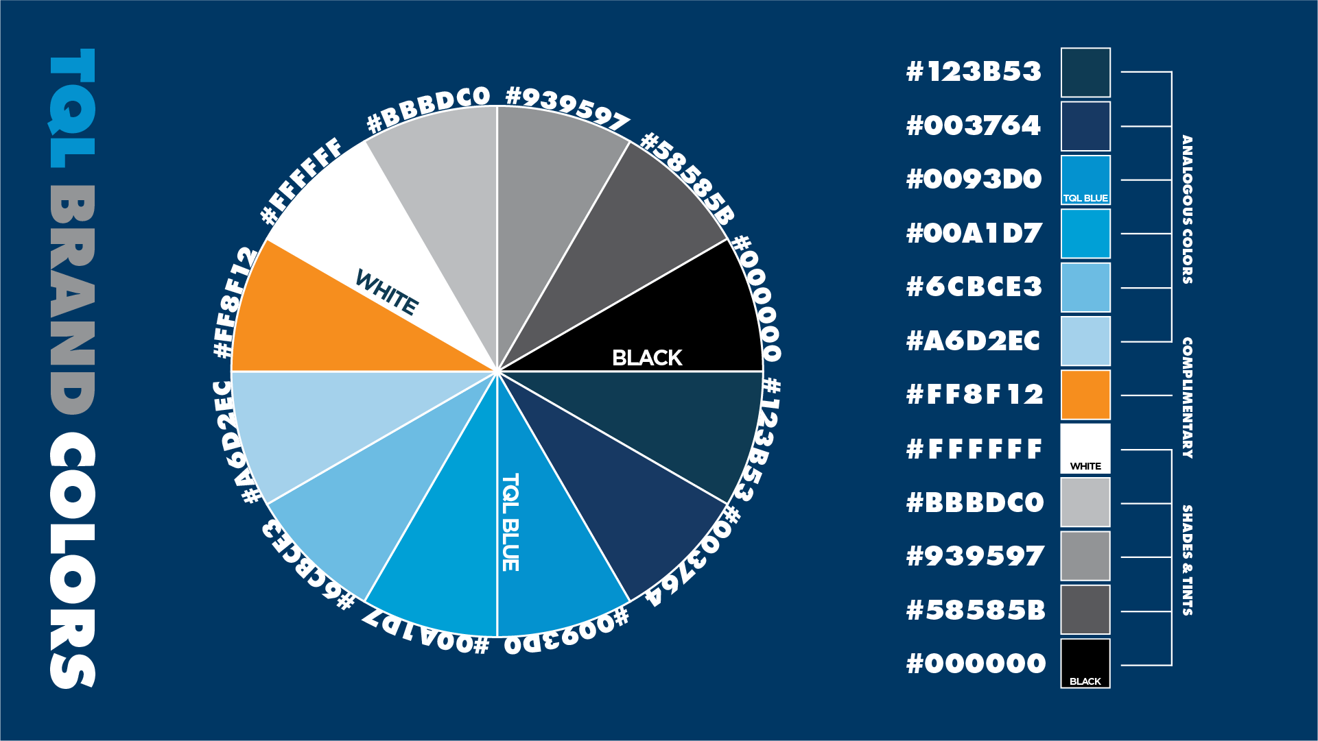
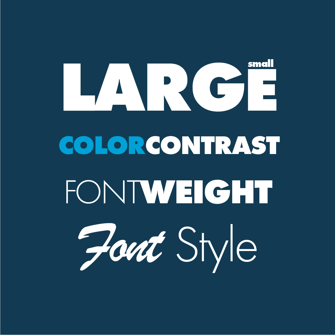
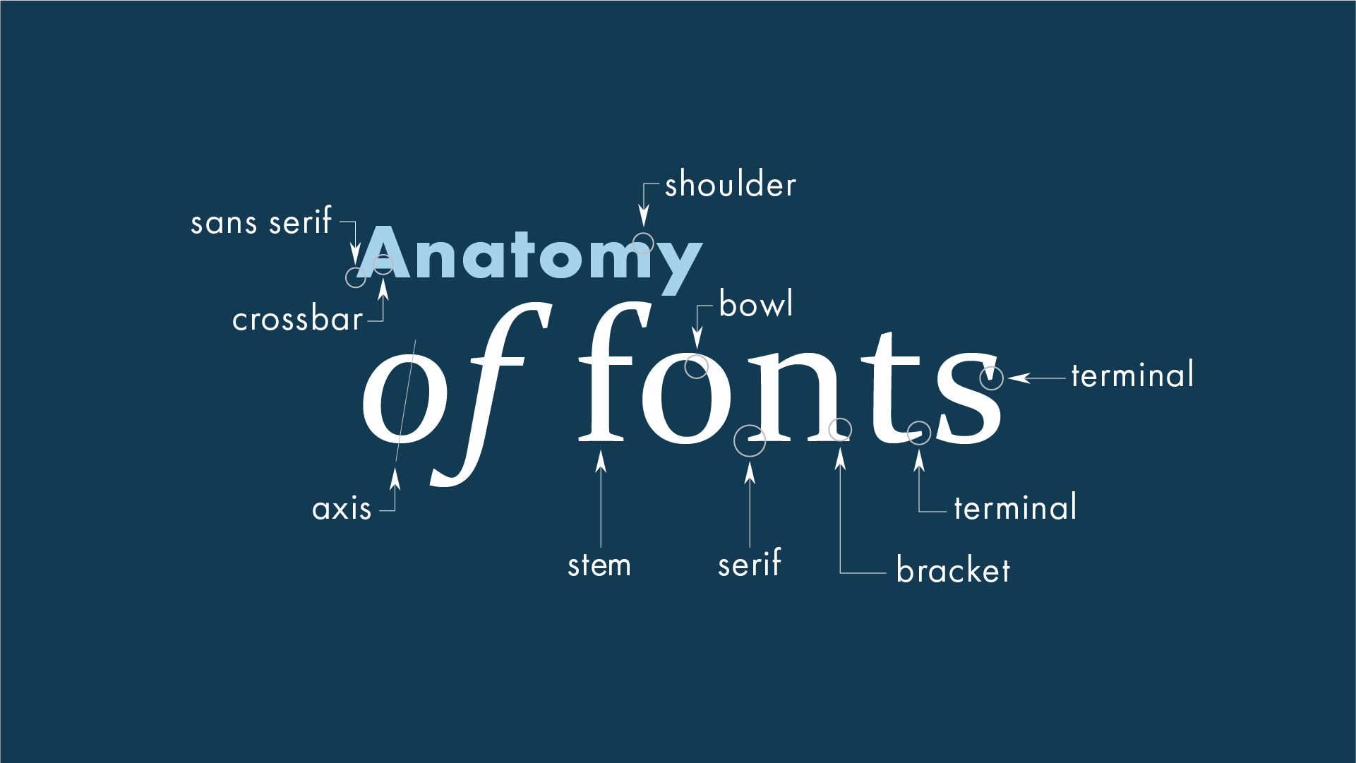
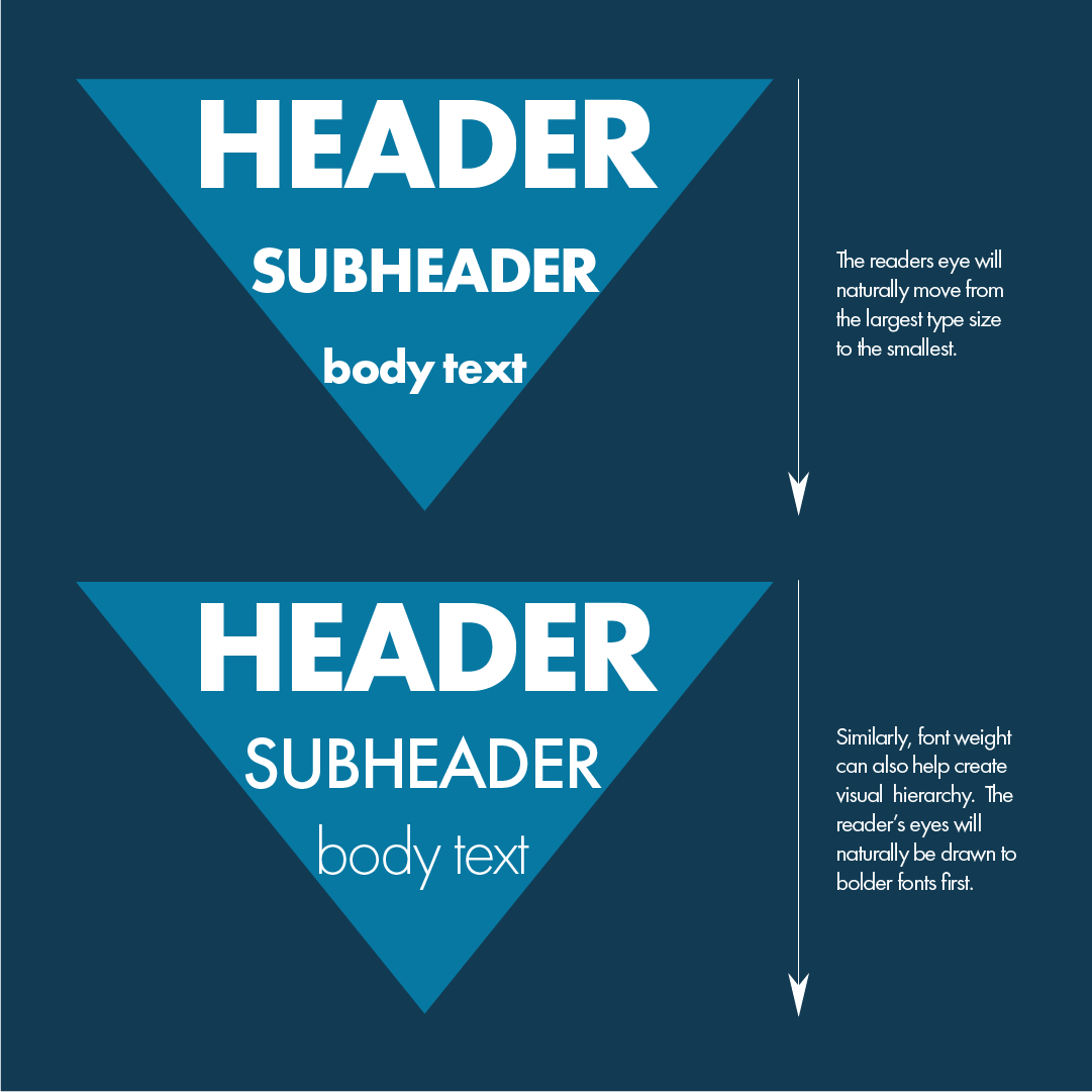
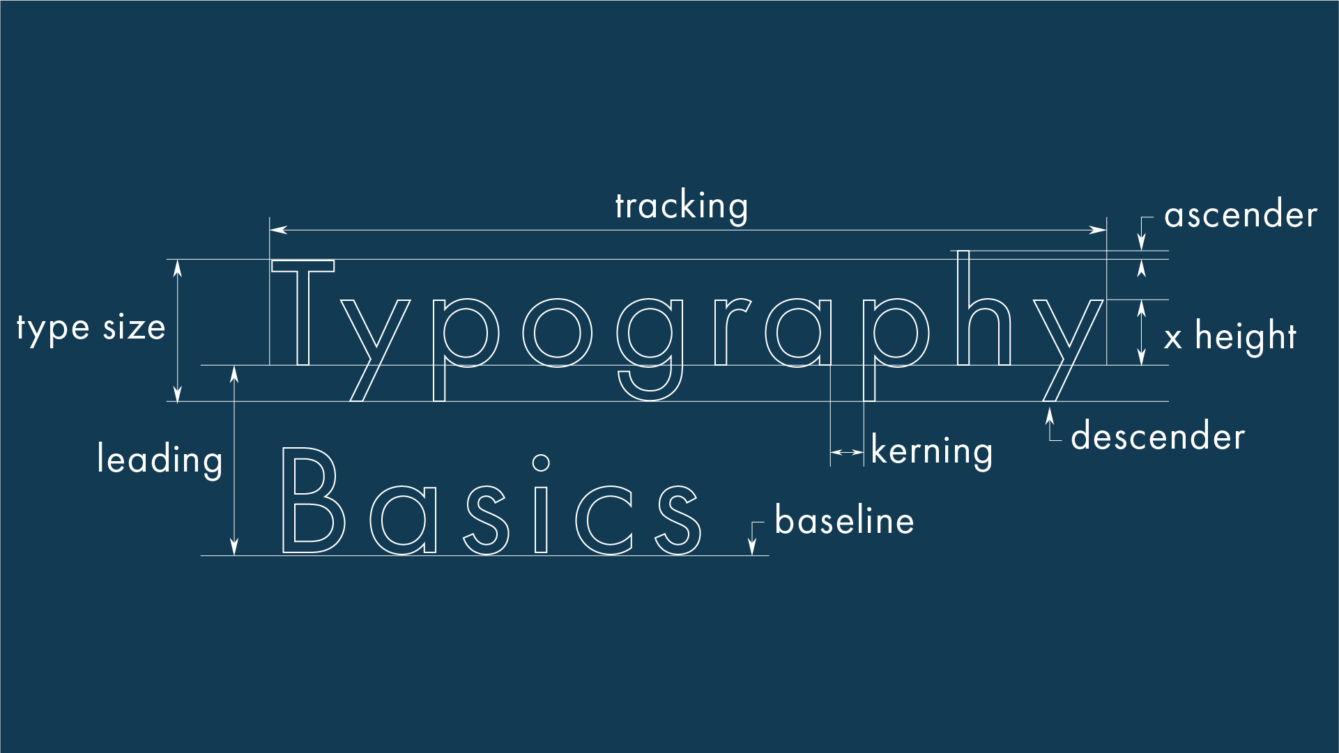
I was tasked with constructing a development guide for new Instructional Designers. I created the graphics above with the company’s brand in mind while also focusing on elements of both Instructional Design and Graphic Design fundamentals. The final product was a Rise course and served as a training and reference guide for new team members. The final Rise was fairly extensive, including sections on using Storyline functions such as animations, layers, triggers, audio/video editing, and exporting as well as the other various software commonly used in Instructional Design: Rise, Vyond, LMS management, WellSaid, Camtasia, Adobe Illustrator, and Adobe Photoshop.

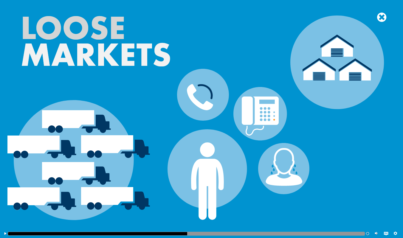
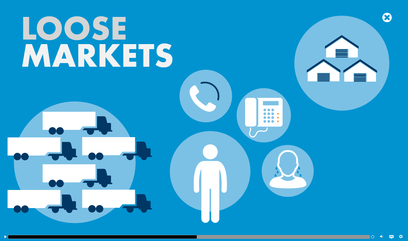
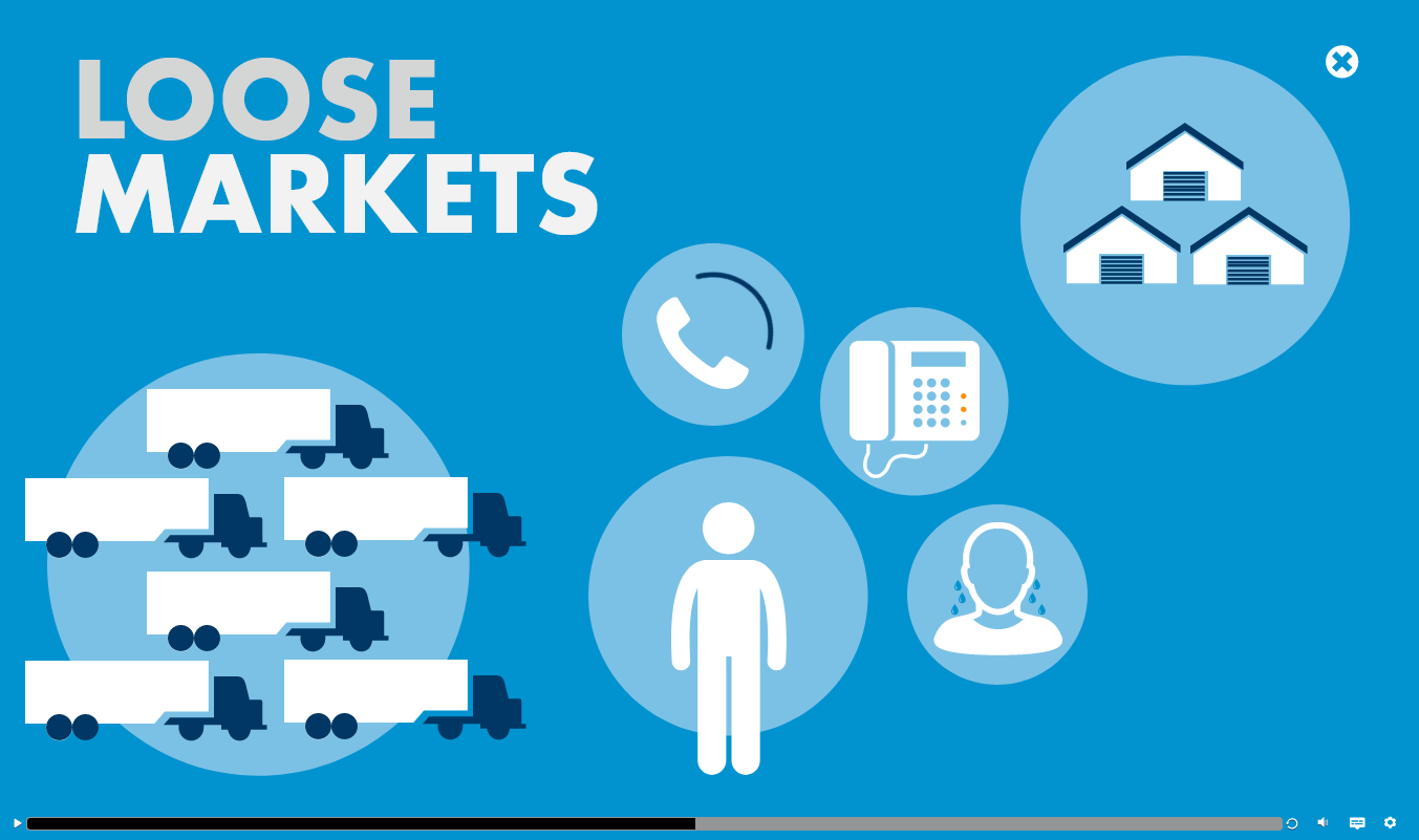
This eLearning was designed in Storyline 360 for a sales negotiating class. This was part of a market specific training designed to give sales team members tips for how to navigate in a loose transportation market. The result is a visually dynamic eLearning that keeps the learner engaged throughout with use of motion paths and animations.
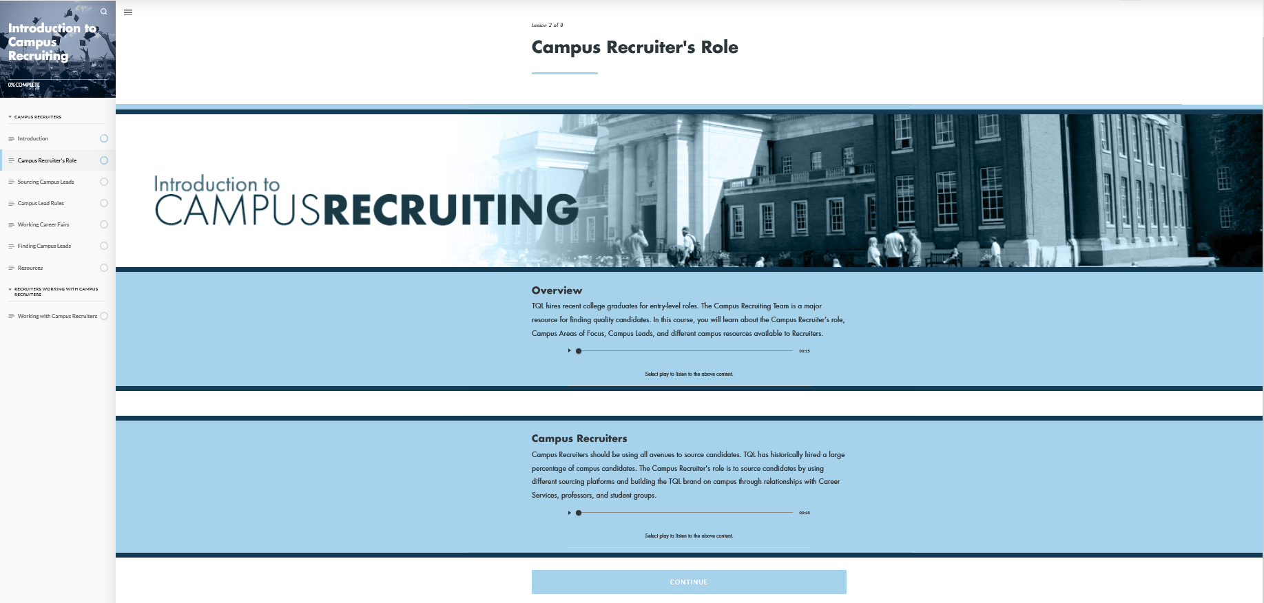
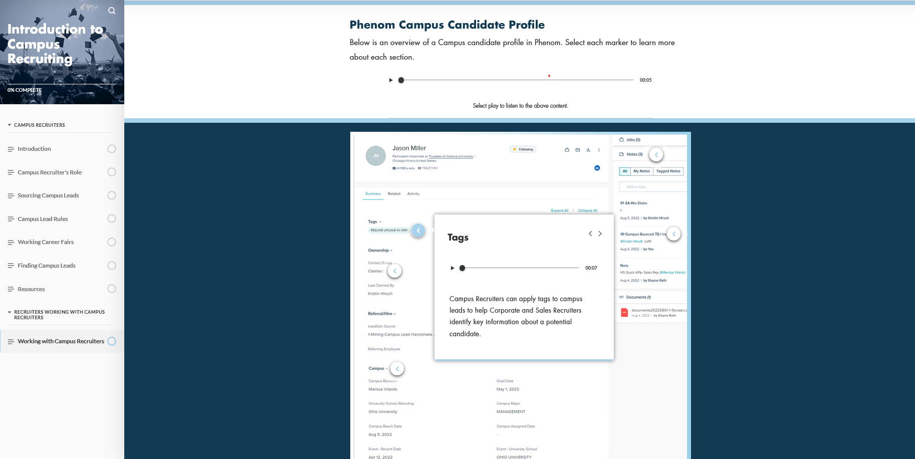
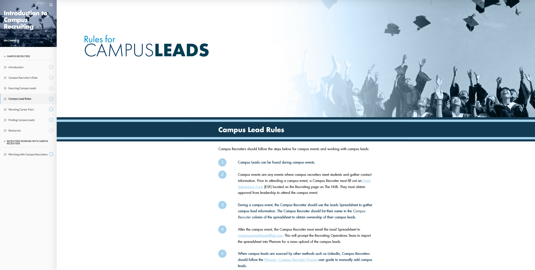
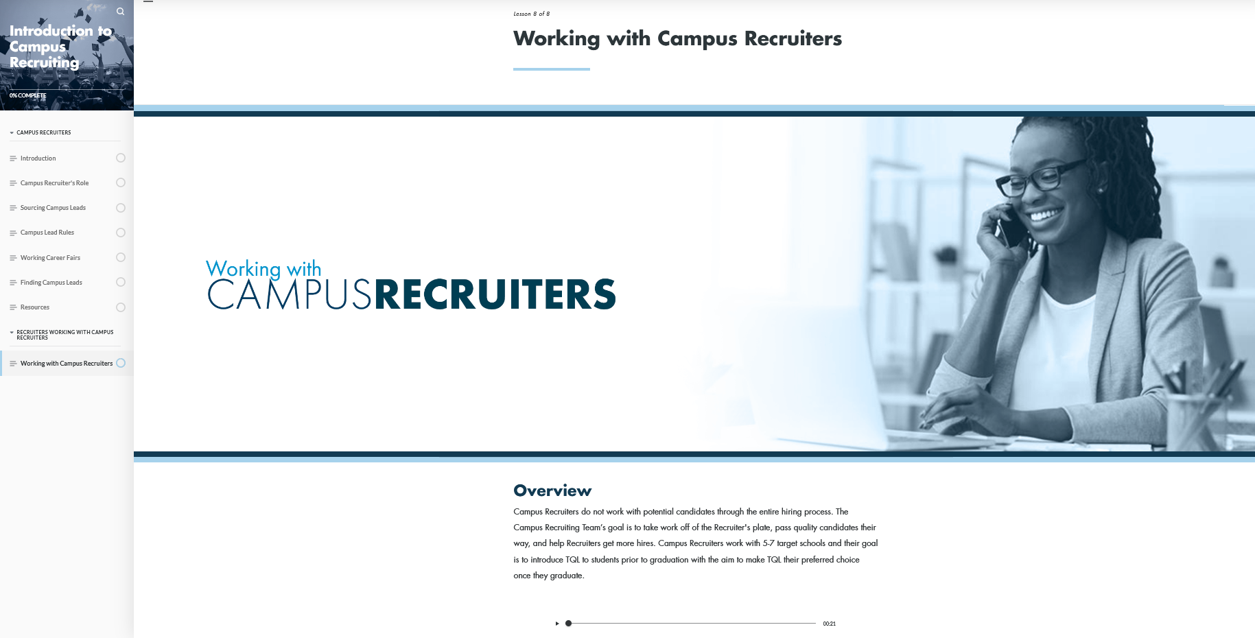
This course was designed in Articulate Rise for a new curriculum geared toward Corporate Recruiters. The training provides an overview of the campus recruiting process with instructions for Corporate Recruiters working with campus leads. The training is an on-demand course that Corporate Recruiters can refer back to as a Reference Guide. I wanted to capture a lighter aesthetic while still utilizing the brand colors in a way that had strong visual contrast with more dynamic typography.